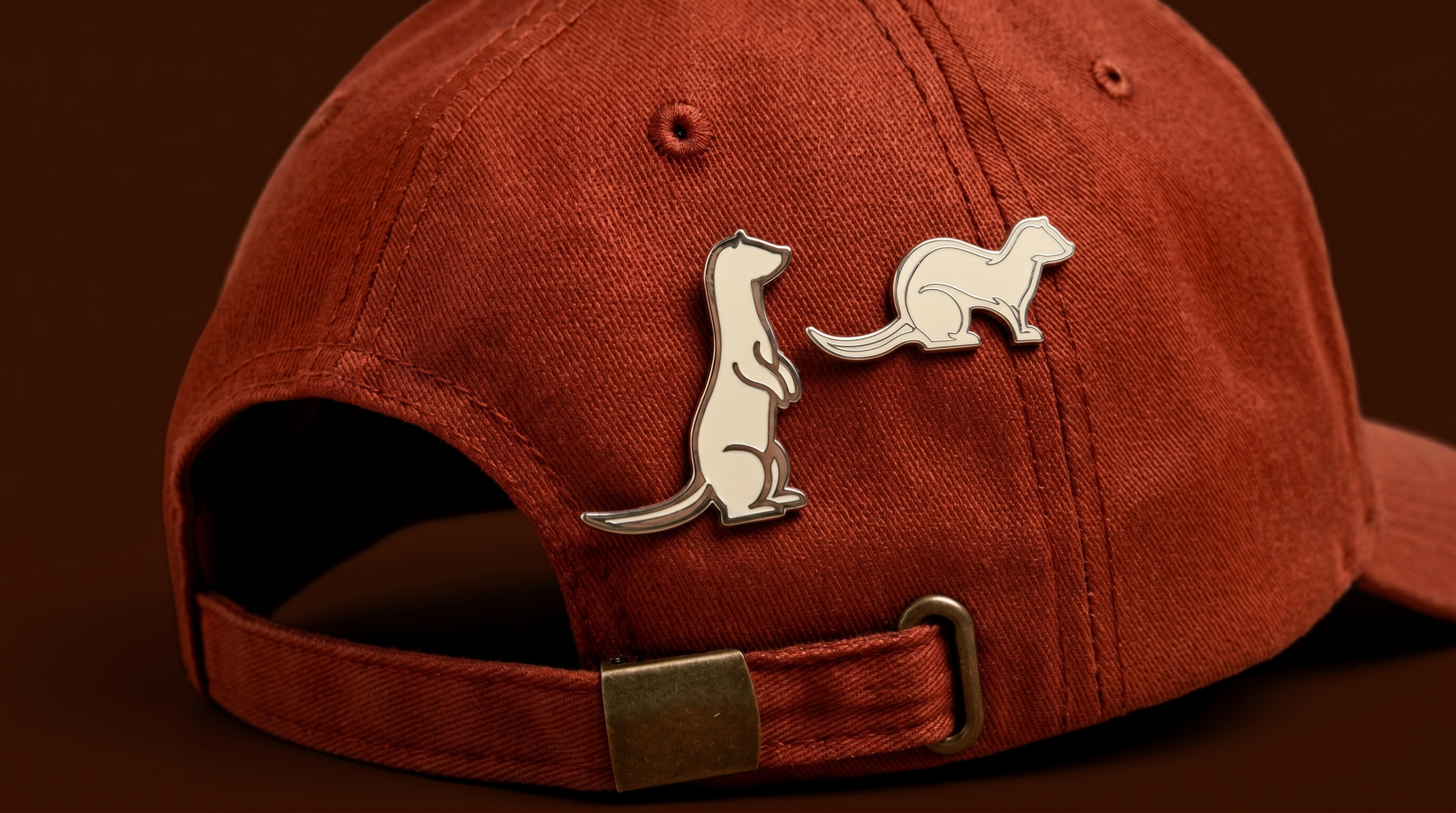

A NEW PRODUCTION COMPANY WITH A PROVEN TRACK RECORD
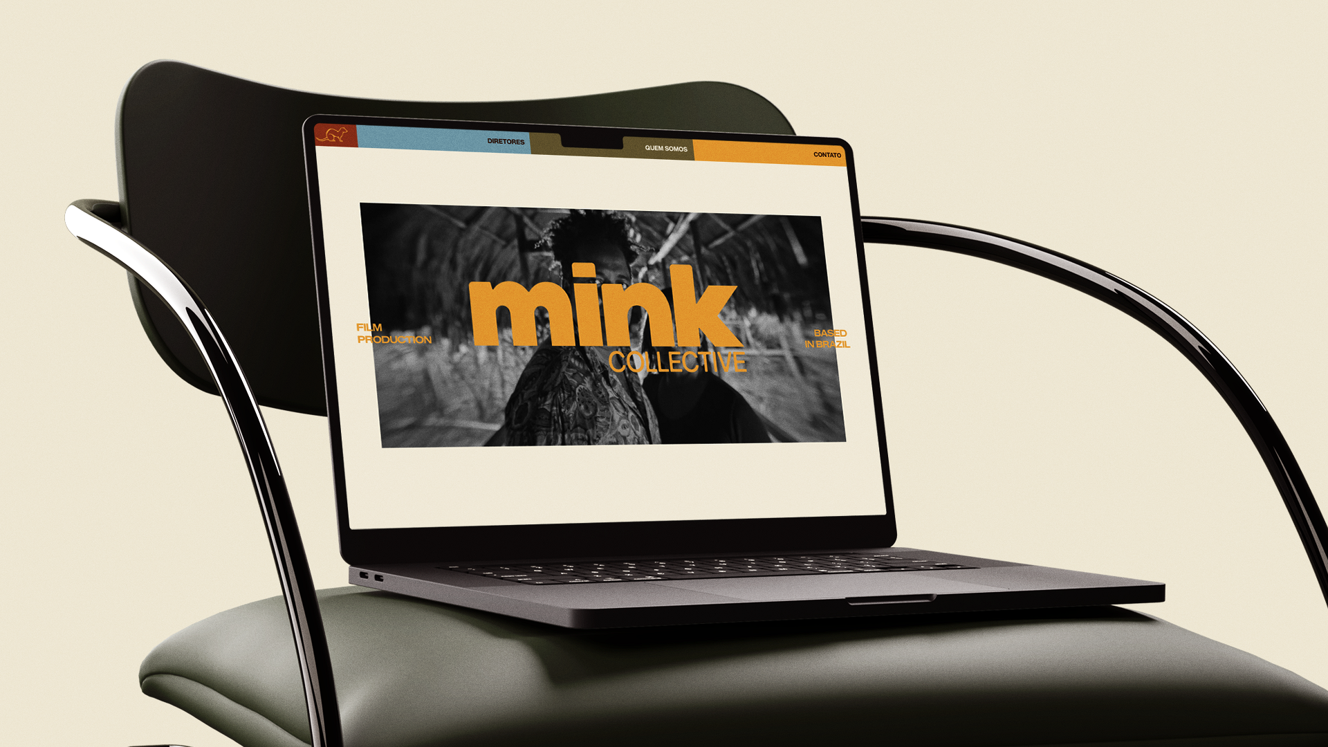
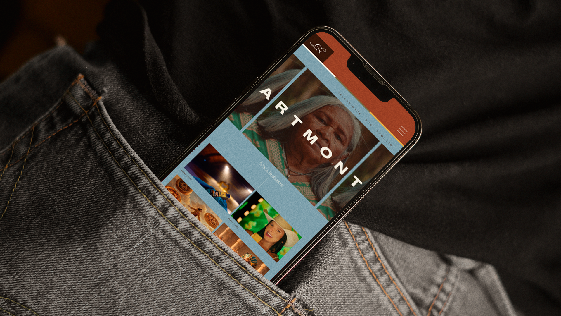
When we started the project, we wanted to move away from the idea of a production company with a closed-off visual identity. Mink was born to be flexible. To adapt to the project, the people, and the needs of each production.
So why would the identity need to be any different?
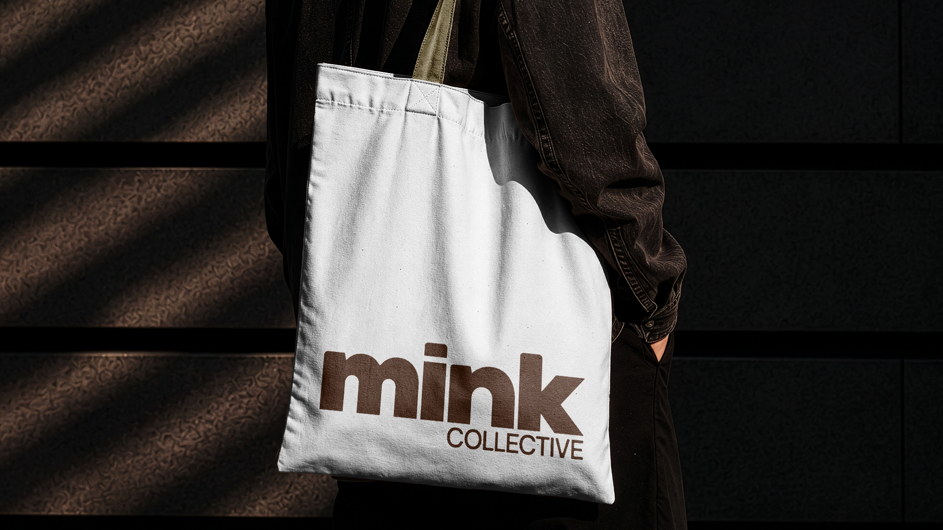
We started from a visual system that could transform without losing its recognition. With simple typography and shapes.
In the end, we arrived at an identity that doesn't try to define Mink by a single aesthetic. It exists precisely to be able to change while staying true to its essence.
If Mink's proposal is to find the best team, the best format, and the best structure for each idea, its identity needed that same freedom.