• Creative Direction
  • Motion Design
  • Visual Identity
Project

Visual Identity

Atena

We created the visual identity for Atena, an eyewear brand with a purpose: to transform how people see themselves. Atena believes that glasses are more than just an accessory; they are a tool for well-being and self-esteem, helping to communicate each individual's personality.
Our challenge was to translate this philosophy into a visual identity that stood out from the conventional. With a playful and sunny concept, we explored shapes and graphic elements derived from the logo itself to compose the visual materials. The choice of the Vina Sans font was crucial to bring the contrast and strength the brand needed to stand out in the optical market.

Team
  • Studio Decodifica Creative Direction and Design
  • Carol Campos Motion Design
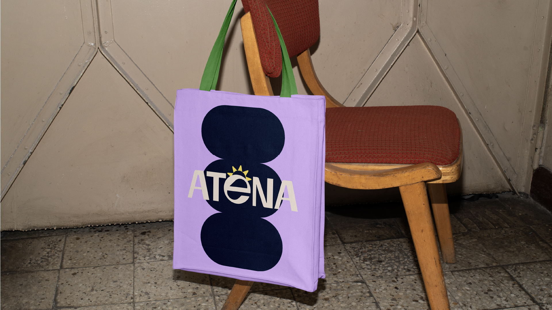
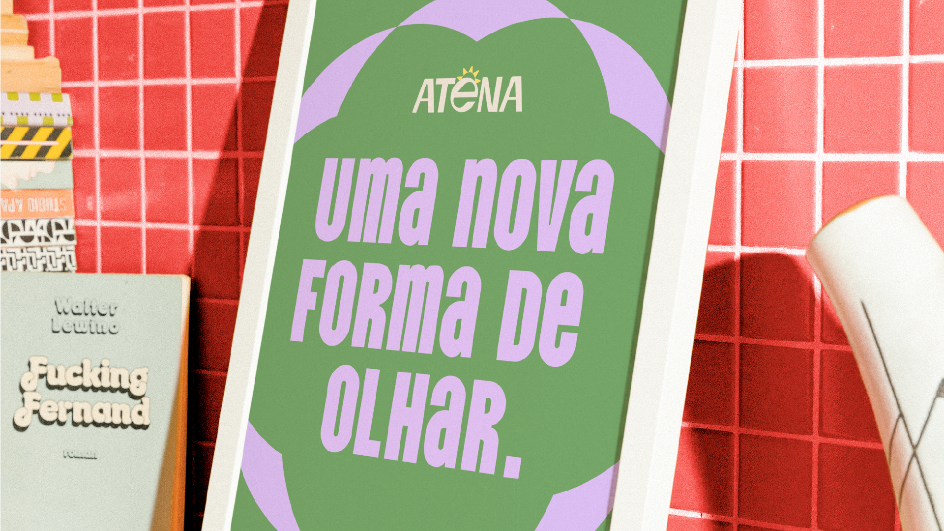
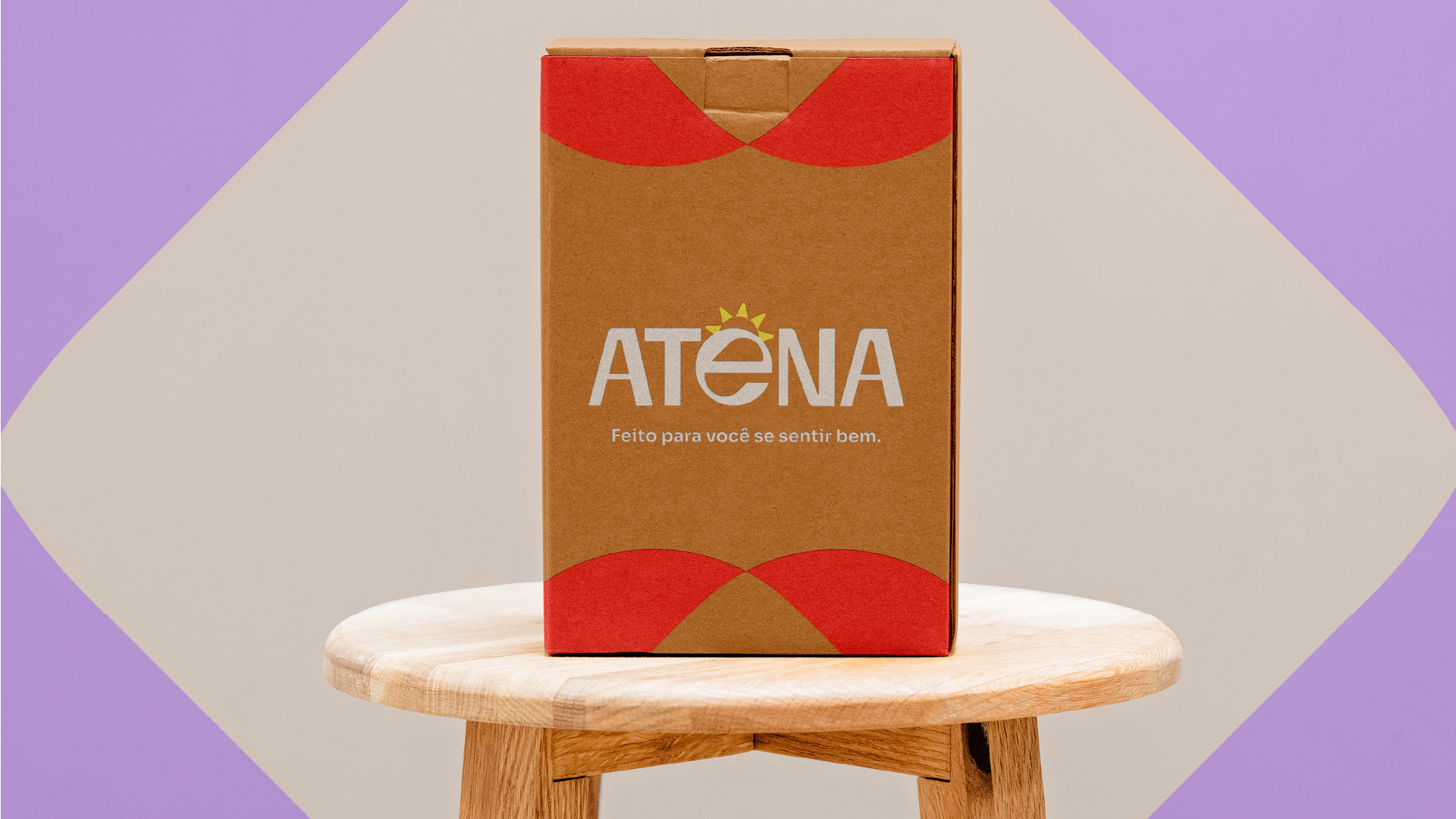
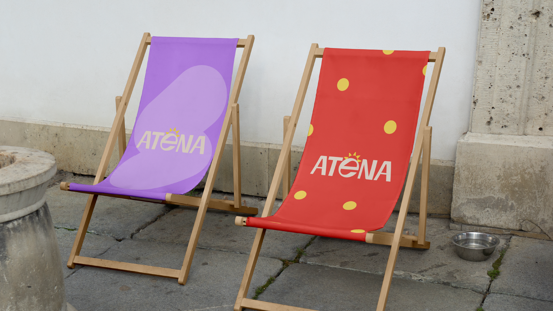
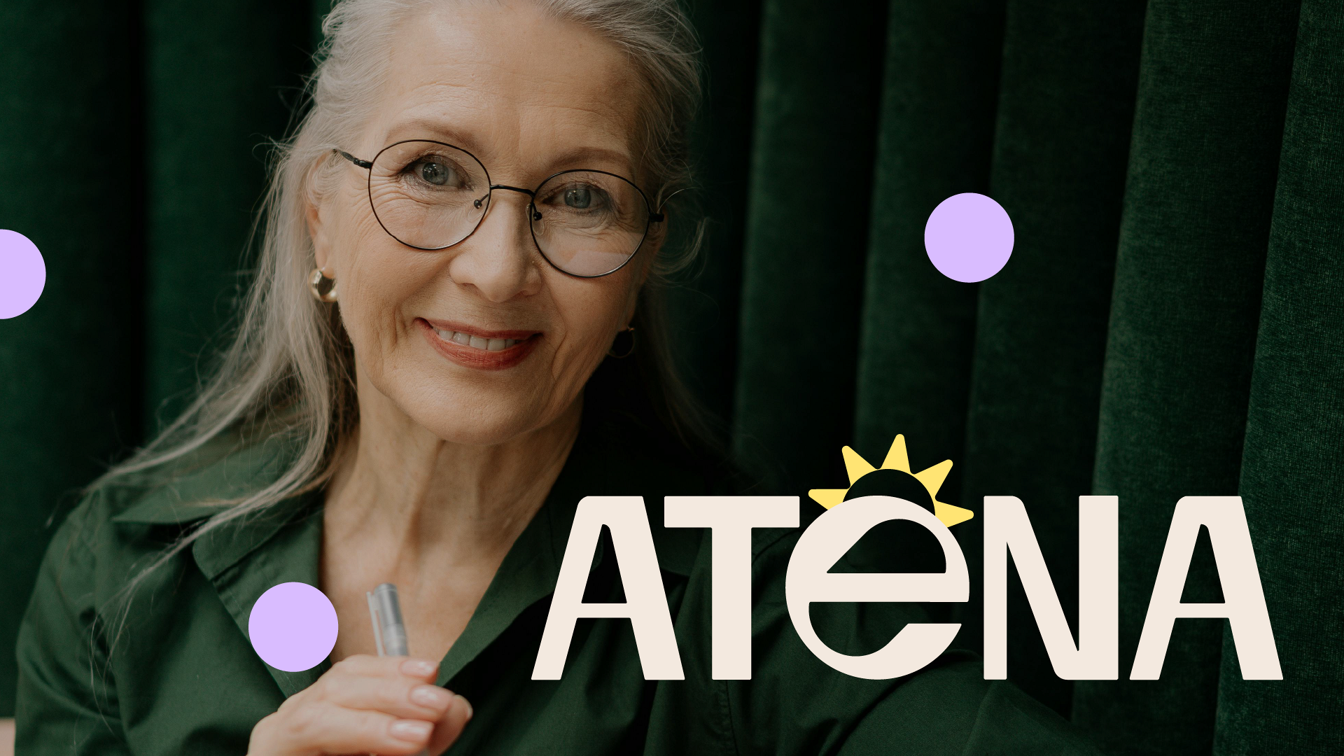
Atena's communication is a direct reflection of its values: accessible, direct, and human.

We avoid jargon and complex terms, opting for a language that resembles a friend's—simple and helpful.

The result is a brand that communicates accessibility, design, and meaning, attracting new audiences who value real-world experience and good service. Atena proves that design and purpose can go hand-in-hand to create something truly meaningful.

This website uses cookies to provide necessary website functionality, improve your experience and analyze our traffic.