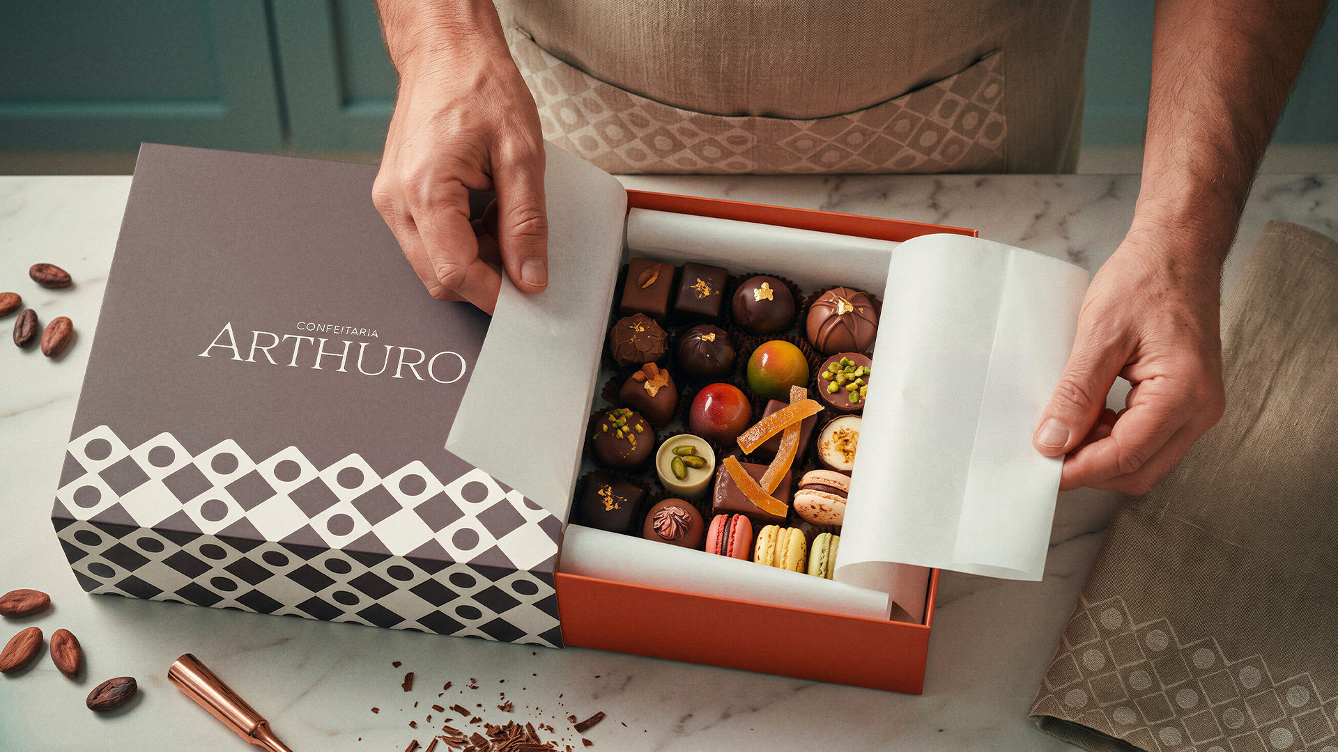

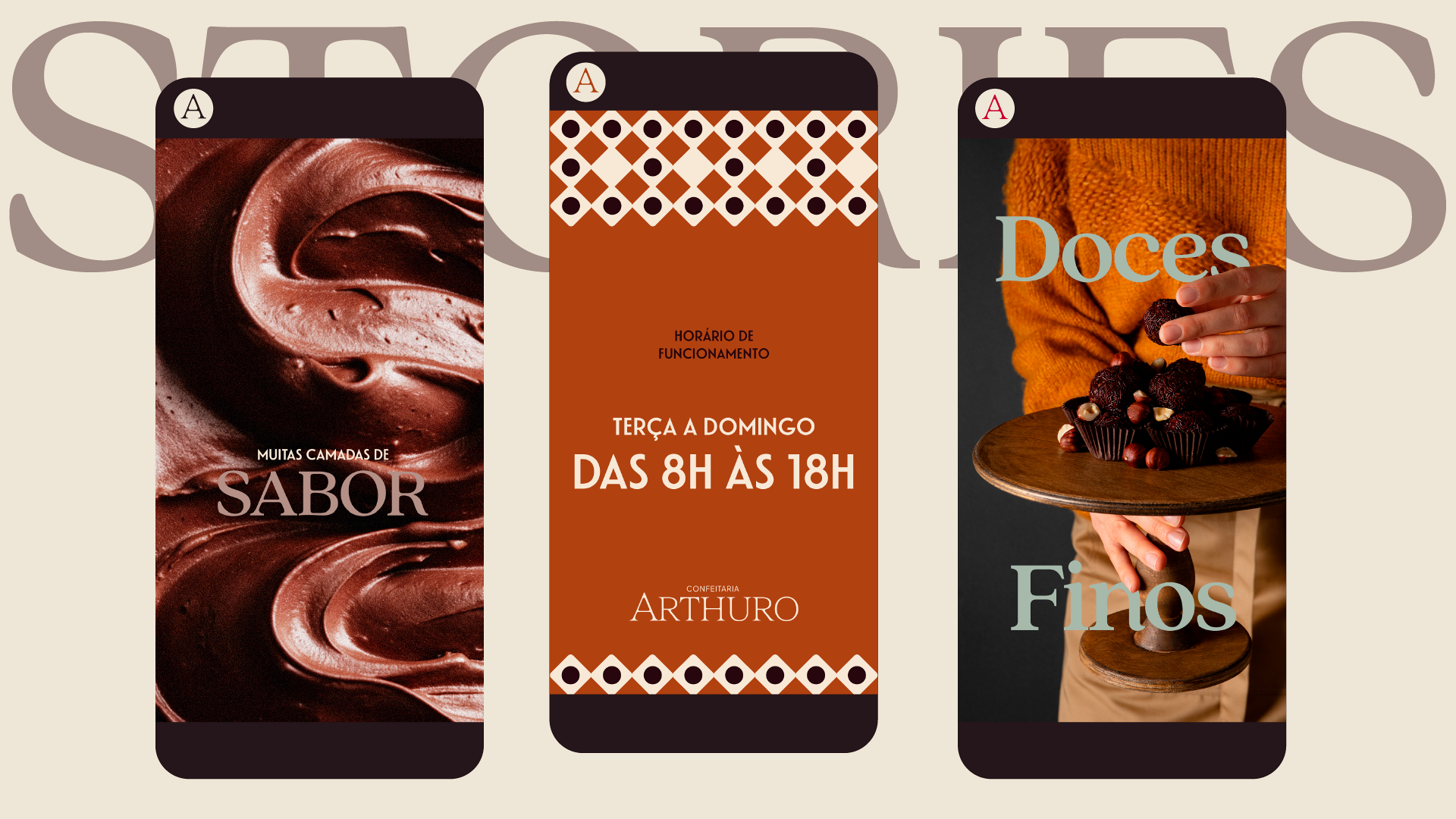

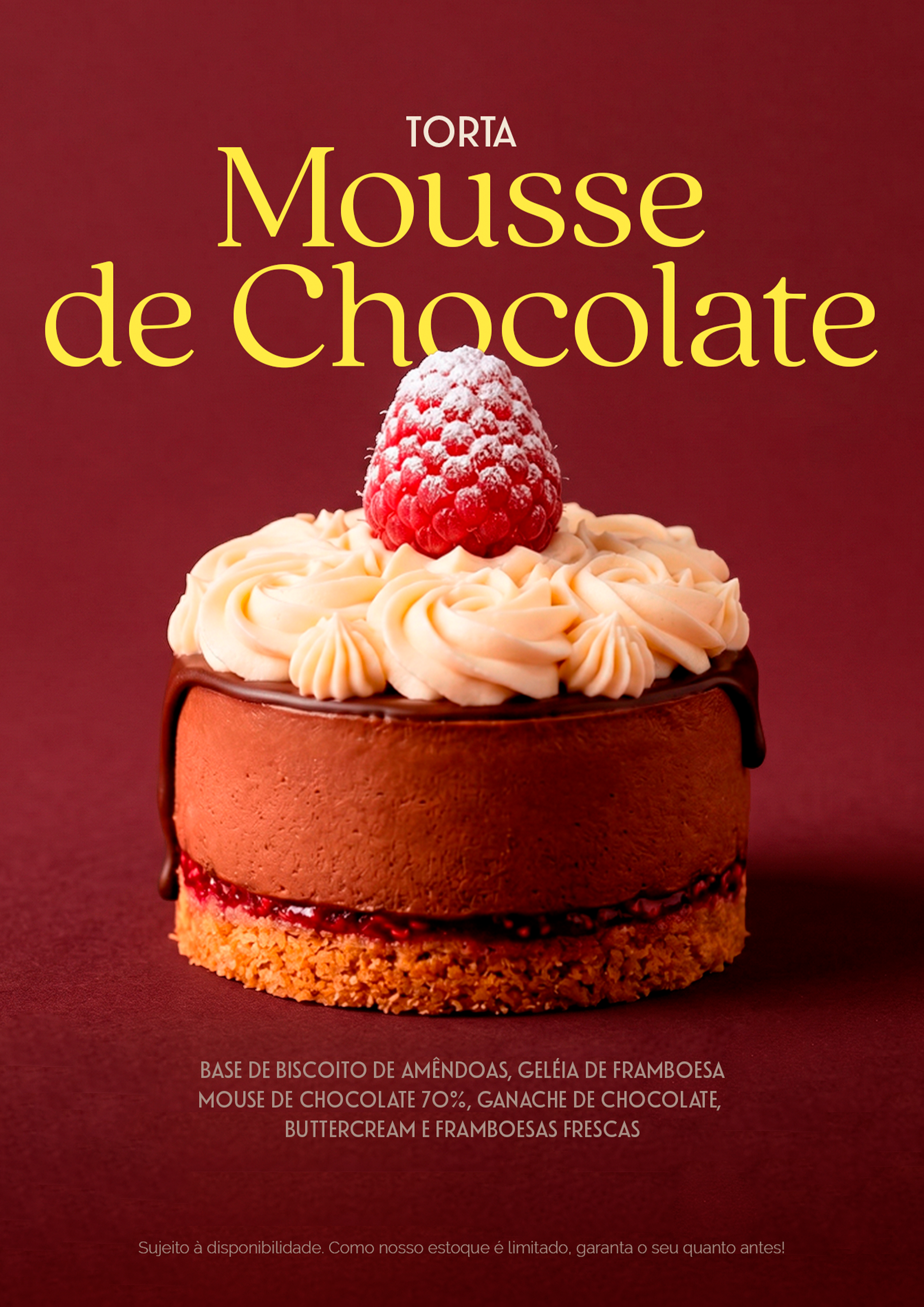


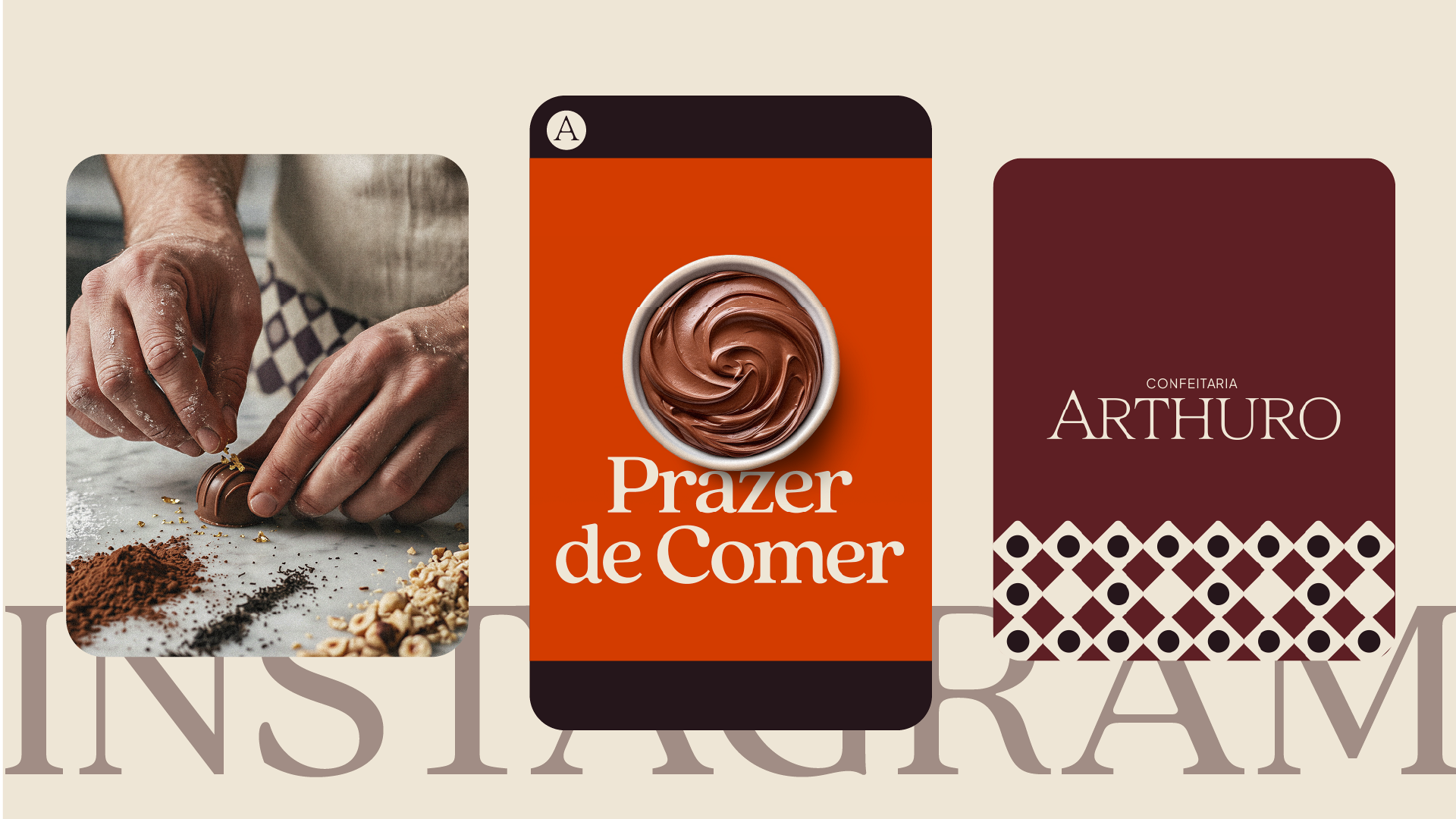




Rooted in family tradition, the bakery was going through a moment of evolution. The goal was to translate into a brand everything that was already part of the customer experience: the care put into every recipe, the careful selection of ingredients, and a story that spans generations.
It was from this process that the name emerged, inspired by the baker's grandson. Arthuro carries the idea of continuity, reinforcing the family nature of the brand and pointing toward its next chapter.
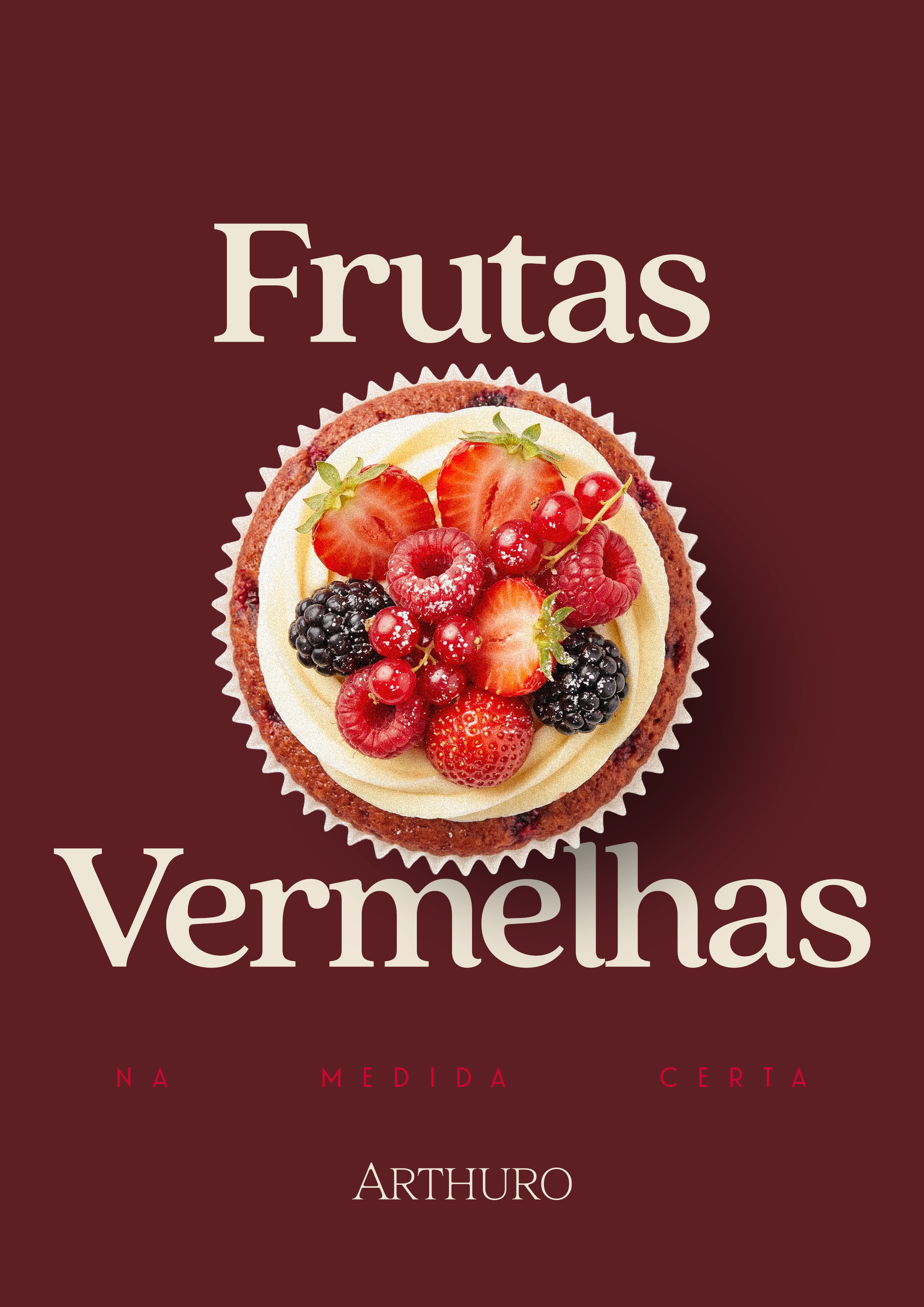
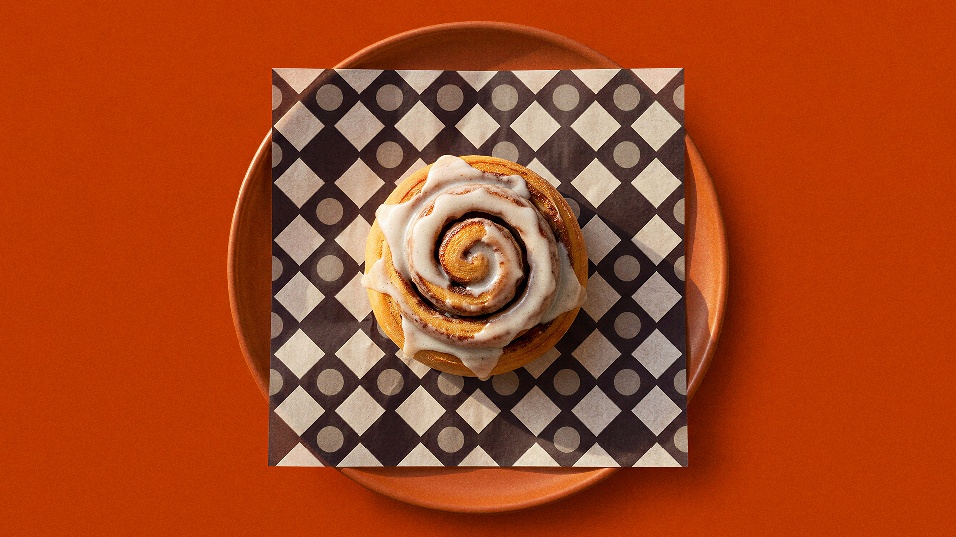
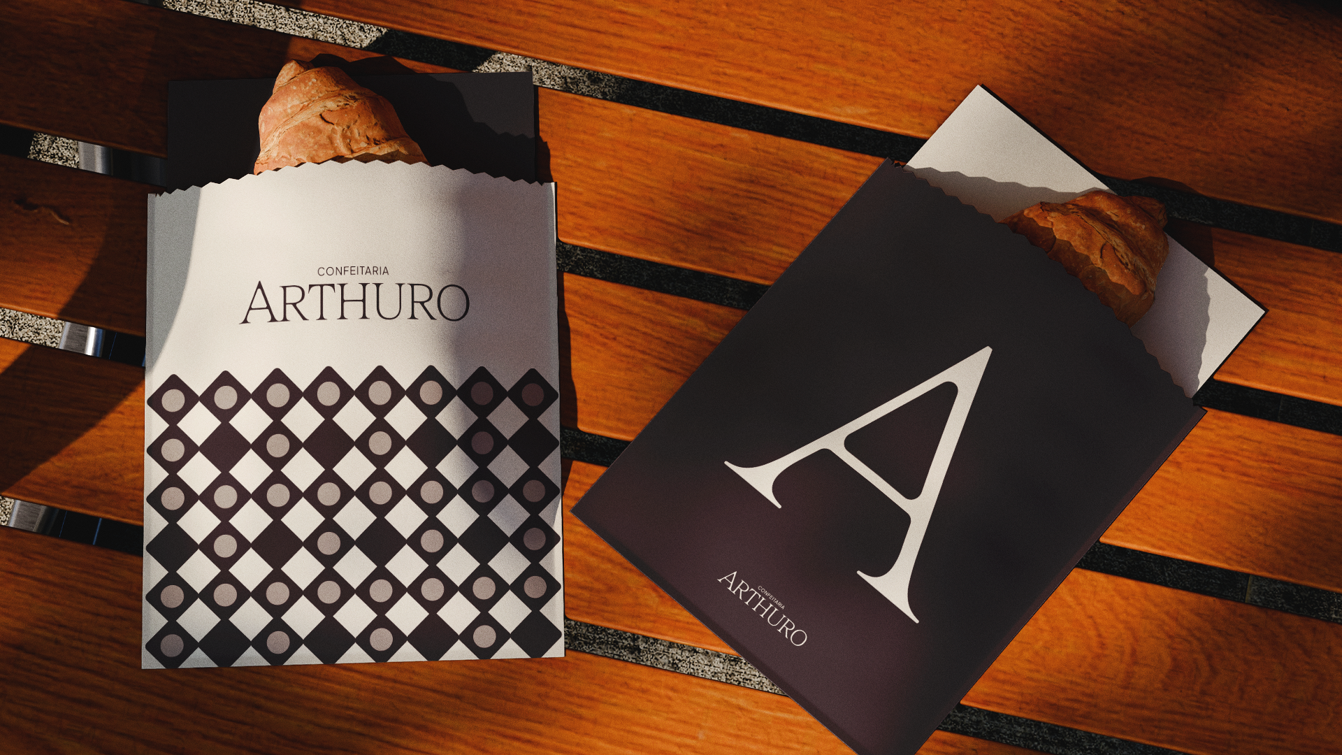
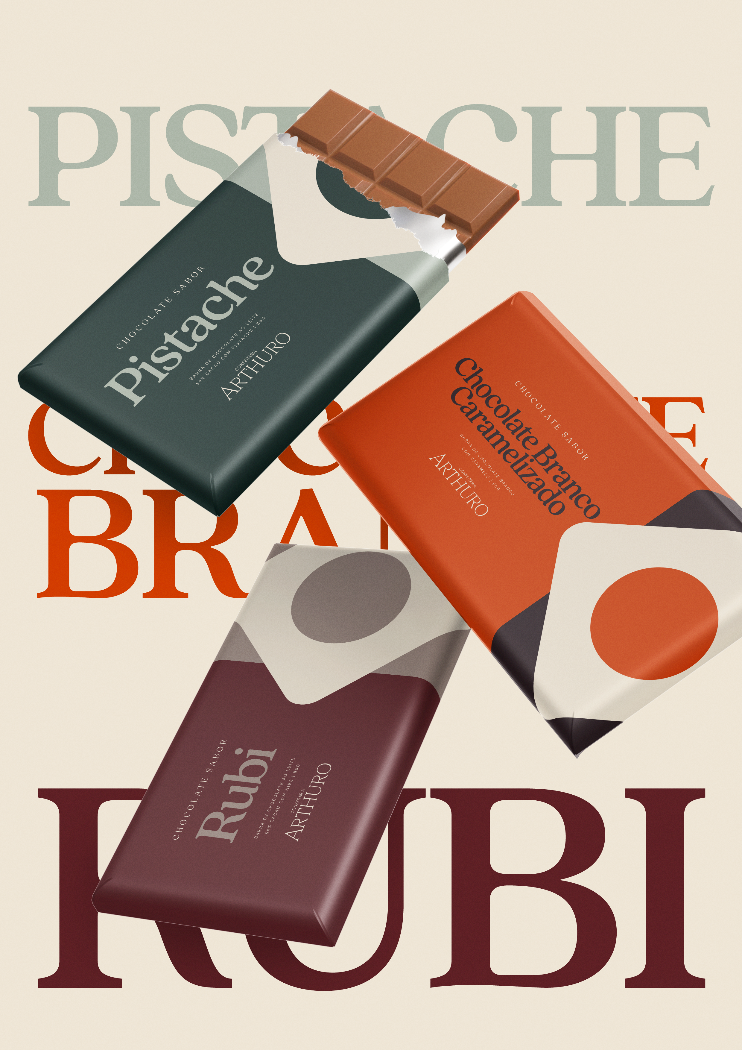
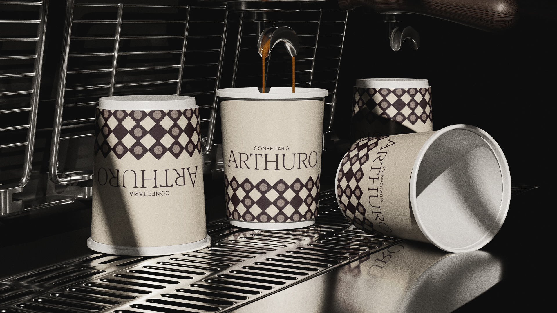
Based on this strategy, we developed a visual identity that balances refinement and approachability. It features an elegant typographic brand that still carries warmth, alongside a palette inspired by ingredients, textures, and flavors that help tell this story at every touchpoint.